Robert Manduca, a Harvard sociology PhD student, has put together a nice visualization of employment data that he titled “Where Are the Jobs?” It’s a great map, modeled after the very popular dot map of US residents by ethnicity. The underlying data come from the Longitudinal Employer-Household Dynamics (LEHD) program, which is a fantastic resource for economics researchers.

Since every job is represented by a distinct dot, it’s very tempting to zoom in and look at the micro detail of the employment geography. Vox’s Matt Yglesias explored the map by highlighting and contrasting places like Chicago and Silicon Valley. Emily Badger similarly marveled at the incredible detail.
Unfortunately, at this super-fine geographical resolution, some of the data-collection details start to matter. The LEHD is based on state unemployment insurance (UI) program records and therefore depends on how state offices reporting the data assign employees to business locations. When an employer operates multiple establishments (an establishment is “a single physical location where business transactions take place or services are performed”), state UI records don’t identify the establishment-level geography:
A primary objective of the QWI is to provide employment, job and worker flows, and wage measures at a very detailed levels of geography (place-of-work) and industry. The structure of the administrative data received by LEHD from state partners, however, poses a challenge to achieving this goal. QWI measures are primarily based on the processing of UI wage records which report, with the exception of Minnesota, only the employing employer (SEIN) of workers… However, approximately 30 to 40 percent of state-level employment is concentrated in employers that operate more than one establishment in that state. For these multi-unit employers, the SEIN on workers’ wage records identifies the employing employer in the ES-202 data, but not the employing establishment… In order to impute establishment-level characteristics to job histories of multi-unit employers, non-ignorable missing data model with multiple imputation was developed.
These are challenging data constraints. I have little idea how to evaluate the imputation procedures. These things are necessarily imperfect. Let me just mention one outlier as a way of illustrating some limitations of the data underlying the dots.
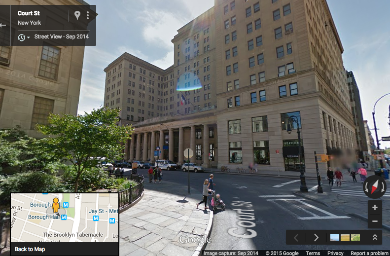
Census block 360470009001004 (that’s a FIPS code; “36” is New York “36047” is Kings County, and so forth) is in Brooklyn, between Court St and Adams St and between Livingston St and Joralemon St. The Borough Hall metro station is on the northern edge of the block. (Find it on the Census Block maps here). A glance at Google Maps shows that this block is home to the Brooklyn Municipal Building, Brooklyn Law School, and a couple other buildings.


What’s special about census block 360470009001004 is that it supposedly hosted 174,000 jobs in 2010, according to the LEHD Origin-Destination Employment Statistics (ny_wac_S000_JT01_2010.csv). This caught my eye because it’s the highest level in New York and really, really high. The other ten census blocks contained in the same census tract (36047000900) have less than 15,000 jobs collectively. This would be a startling geographic discontinuity in employment density. The census block with the second highest level of employment in the entire state of New York has only 48,431 employees.
A glance at the Brooklyn Municipal Building shows that it’s big, but it sure doesn’t make it look like a place with 174,000 employees.

And other data sources that do report employment levels by establishment (rather than state employer identification number) show that there aren’t 174,000 jobs on this block. County Business Patterns, a data set that is gathered at the establishment level, reports that total paid employment in March 2010 in ZIP code 11201, which contains this census block and many others, was only 52,261. Looking at industries, the LODES data report that 171,000 of the block’s 174,000 jobs in 2010 were in NAICS sector 61 (educational services). Meanwhile, County Business Patterns shows only 28,117 paid employees in NAICS 61 for all of Brooklyn (Kings County) in 2010. I don’t know the details of how the state UI records were reported or the geographic assignments were imputed, but clearly many jobs are being assigned to this census block, far more than could plausibly be actually at this geographic location.
So you need to be careful when you zoom in. Robert Manduca’s map happens to not be too bad in this regard, because he limits the geographic resolution such that you can’t really get down to the block level. If you look carefully at the image at the top of this post and orient yourself using the second image, you can spot the cluster of “healthcare, education, and government” jobs on this block near Borough Hall just below Columbus Park and Cadman Plaza Park, which are jobless areas. But with 171,000 dots on such a tiny area, it’s totally saturated, and its nature as a massive outlier isn’t really visible. In more sparsely populated parts of the country, where census blocks are physically larger areas, these sorts of problems might be visually evident.
“Where Are The Jobs?” is an awesome mapping effort. It reveals lots of interesting information; it is indeed “fascinating” and contains “incredible detail“. We can learn a lot from it. The caveat is that the underlying data, like every other data source on earth, have some assumptions and shortcomings that make them imperfect when you look very, very closely.
P.S. That second-highest-employment block in New York state? It’s 360470011001002, across the street from the block in question. With 45,199 jobs in NAICS sector 48-49, Transportation and Warehousing. But all of Kings County reported only 18,228 employees in NAICS 48 in 2010 in the County Business Patterns data.


